Weather Help Back to Weather
Using The FVB Weather Station
The weather station is mounted on the roof above the auditorium. It has sensors for temperature, wind, rain, humidity, solar radiation, and barometric pressure. These display the current conditions and also record the information in graphical form and historical data tables. The weather station has only been active since mid-April, so we’ll have to wait a while before we get useful historical data.
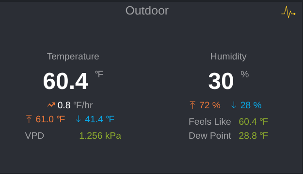
VPD Vapor Pressure Deficit, a measurement (in kilopascals, kPa) that indicates how “thirsty” the air is, calculated from the relationship between temperature and relative humidity.
“Feels like” value is defined by wind chill temperature and heat index for cold (below 40° F and wind speed larger than 5mph), and hot conditions (temperature is over 80° F and humidity is over 40%), so when outside the above-defined conditions, the “feels like” value is the same as that of the current outdoor temperature.
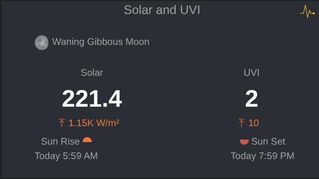
On the weather station, “Solar W/m²” stands for Solar Radiation measured in Watts per square meter. It is a real-time measurement of the intensity of sunlight striking the outdoor sensor array.
- Intensity Measurement: It indicates how much solar power is currently reaching our location. On a clear day at solar noon, this value can reach up to 1000 W/m² or more.
- UVI stands for the Ultraviolet Index, an internationally standardized measure of the strength of sunburn-producing UV (ultraviolet) radiation from the sun reaching the Earth’s surface.
- 0 – 2 (Low): Minimal risk. Sunscreen is not strictly necessary.
- 3 – 5 (Moderate): Moderate risk of harm. Sunscreen is recommended.
- 6 – 7 (High): High risk of unprotected sun exposure. Sunscreen, a hat, and sunglasses are recommended.
- 8 – 10 (Very High): Very high risk. Protection is crucial; skin can burn quickly. Avoid being outdoors during midday hours if possible.
- 11+ (Extreme): Extreme risk. Unprotected skin can suffer damage in minutes.
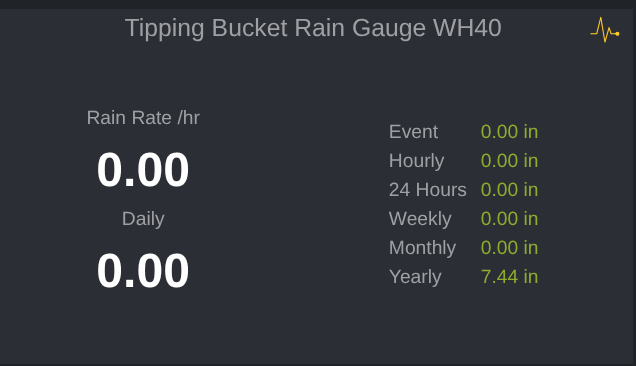
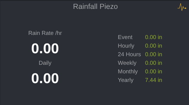
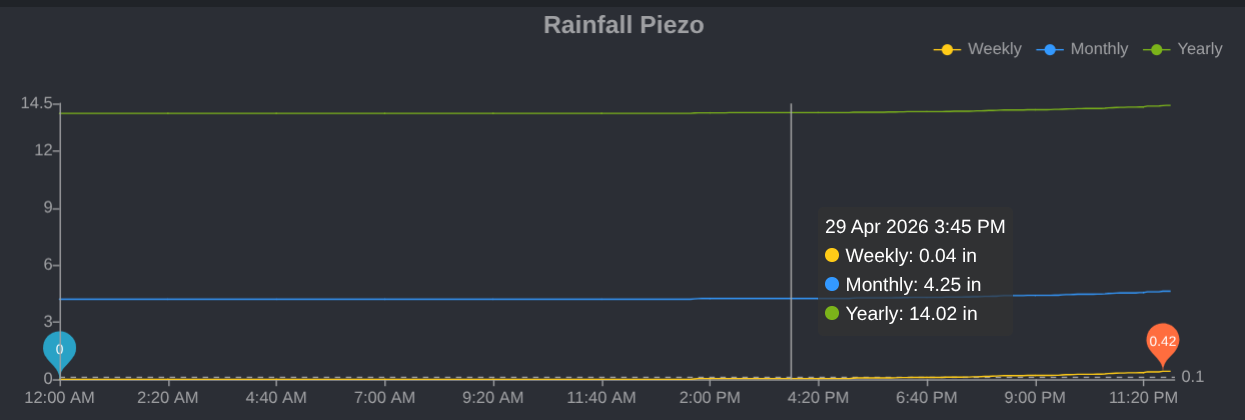
Rain Definition: Daily, 24H, Event, Week, Month, Year, Total
- Daily: rain counter reset to 0 at midnight.
- 24H: accumulated rain for the past 24hours.
- Event: It resets to 0 when 24H rain is less than 2.0mm. So it continues to accumulate as long as it doesn’t stop raining. So during springtime, it keeps raining, and this rainy period can last for quite a long time, like 3 weeks or even months.
- Week: it resets to 0 at midnight Sunday.
- Month: It resets to 0 at midnight on the first day of the month.
- Year: It resets to 0 at midnight on the first day of the year.
- Total: The total rain ever recorded.
 What are the differences between the Tipping Bucket Rain Gauge and the Piezoelectric Rain Gauge?
WH40H Rain Gauge Sensor (Tipping Bucket)
- Mechanism: Uses a funnel to collect water, which tips a tiny bucket inside when full, sending a wireless signal.
- Accuracy: Considered high-precision for residential weather stations, with a larger collector design, “high precision,” and accuracy.
Piezoelectric Rain Gauge (Haptic)
- Mechanism: Uses sensors to detect the vibration/impact of individual raindrops on the surface.
- Accuracy: Offers instant, real-time measurements but is less accurate, harder to calibrate, and less consistent than the WH40.
- Cons: Less accurate in light drizzle, sensitive to vibrations, and less reliable for total daily rainfall compared to tipping buckets.
Verdict: For serious weather monitoring, the Tipping Bucket WH40 is superior. The piezoelectric sensor is excellent for real-time measurements, but the traditional tipping bucket is better for accurate rainfall accumulation.
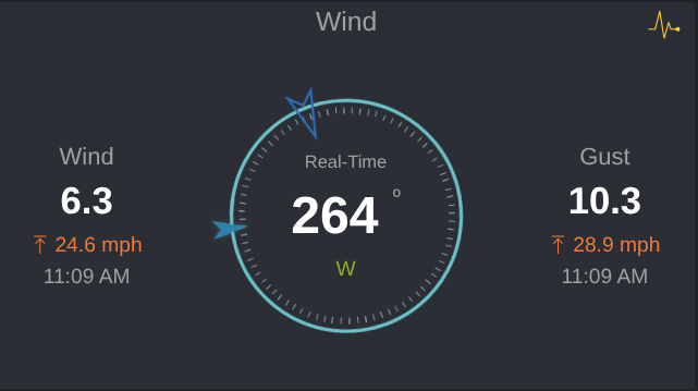
Real-Time Speed: The current wind speed.
Average Wind Speed: over 16 seconds at the time shown.
Peak Gust: The maximum/highest recorded wind speed captured during that same measurement interval since midnight.
- The Larger Arrow: This indicates the most recently measured wind direction (captured in the last 16 seconds or less).
- The Smaller Arrow: This represents the average wind direction over the prior measurement interval.
- If you only see one pointer, it means the wind has been blowing steadily from that single direction, and both the current and average pointers are perfectly overlapping.
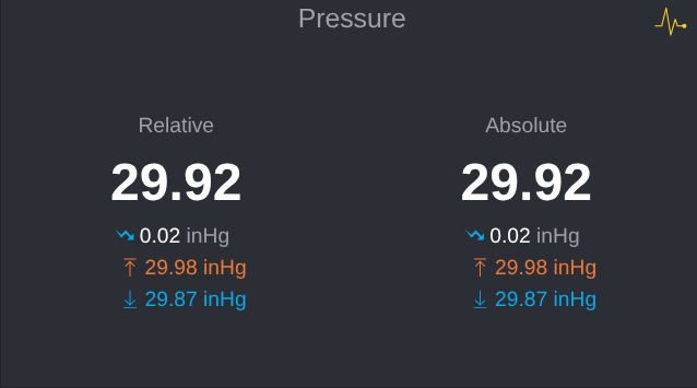
Barometric Pressure (sensor elevation is 625ft) – Absolute vs. Relative Pressure
- Absolute Pressure (ABS): The actual atmospheric pressure measured directly at our sensor’s current elevation (625ft). Because pressure drops as altitude increases, this number will be significantly lower than standard sea-level pressure if you live above sea level.
- Relative Pressure (REL): The absolute pressure mathematically “corrected” to sea level so it can be compared to local airport or TV weather reports.
Chart Area
The graphics and charts on the Ecowitt process raw environmental data into visual trends.
Display Settings
- Graphical or Tabular display of data
- Displayed time period
- Daily (The default: Display will return to Daily on restart)
- 24 hours
- Meteorological Days: Span the period 9:00 a.m. to 9:00 a.m. the following day.
- Weekly
- Monthly
- Yearly
- 7 days
- 30 days
- Custom
- Historic period selection
- Data export in spreadsheet form
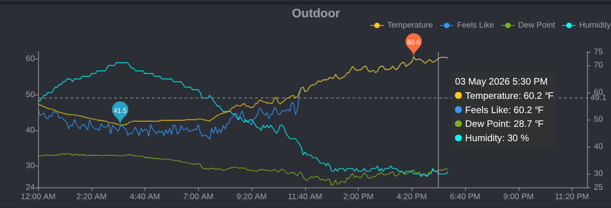
Temperature & Humidity Graphs
Left Scale = Temperature Right Scale = Humidity
Dotted Line: A dotted line spans horizontally to show the daily or period average.
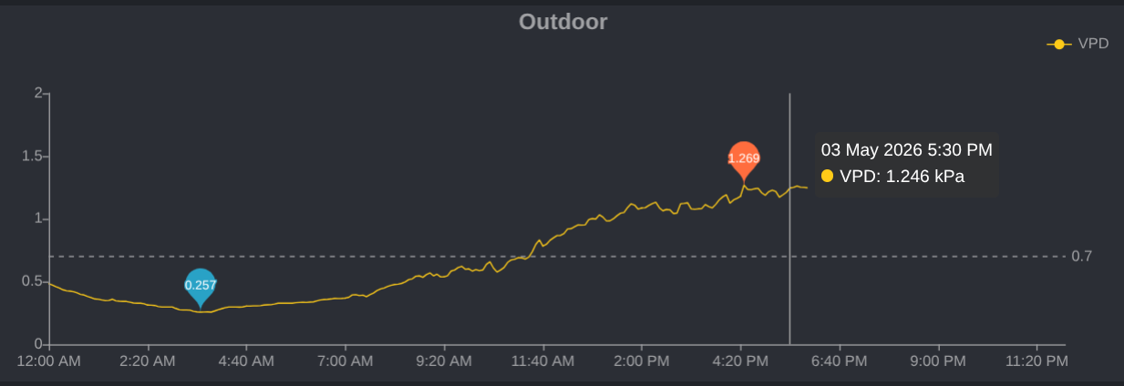 VPD Vapor Pressure Deficit
A measurement of how “thirsty” the air is, calculated from the relationship between temperature and relative humidity.
Note: The blue and orange balloons in the charts indicate low and high readings for each weather value.
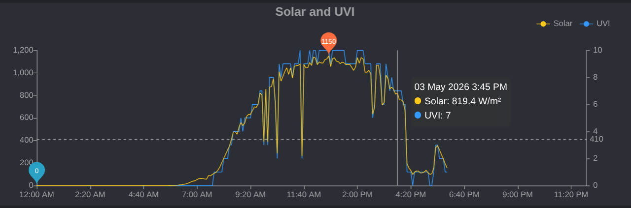 Solar & UV Intensity Integration
The Smooth Bell Curve: On clear days, the Solar Radiation (\(W/m^2\)) and UV Index graphs will render a perfectly smooth symmetrical dome.
Jagged Spikes: Rapid, sharp drops in the graphic curve indicate passing clouds.
UVI stands for the Ultraviolet Index, an internationally standardized measure of the strength of sunburn-producing UV (ultraviolet) radiation from the sun reaching the Earth’s surface.
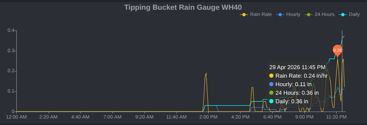 Rainfall Graphing
Multi-Tier Gauges: Rate per Hour & Hourly, 24 Hours, and Daily accumulation totals.
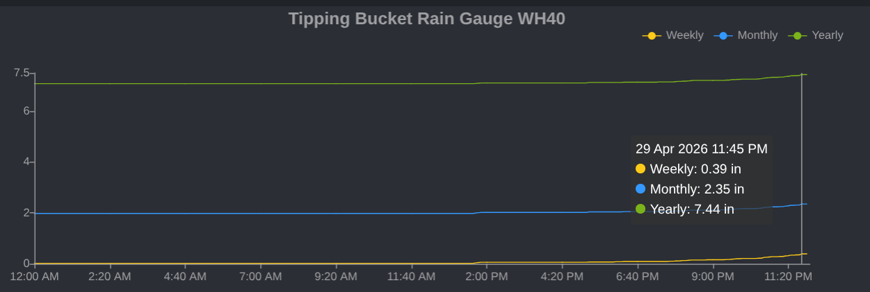 Rainfall Graphing
Multi-Tier Gauges: Weekly, Monthly, and Annual accumulation totals.
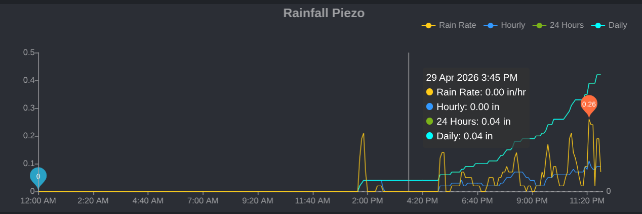 Rainfall Graphing
Multi-Tier Gauges: Rate per Hour & Hourly, 24 Hours, and Daily accumulation totals.
 Rainfall Graphing
Multi-Tier Gauges: Weekly, Monthly, and Annual accumulation totals.
 Wind Visualization Speed – Gusts – Direction
- Wind speed: shown by the yellow line.
- Blue arrow icons at the top indicate the wind direction throughout the day.
- The shaded blue peaks show how high the wind spiked above the sustained speed.
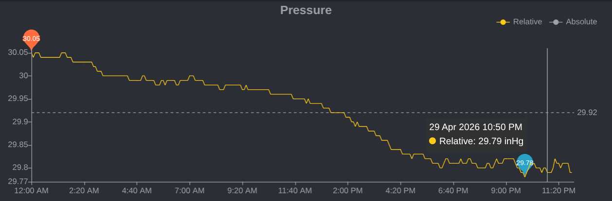 Barometric & Pressure Trends
This visualizes a continuous rolling history line to monitor rising or falling atmospheric pressure.
The dotted horizontal line represents the median atmospheric pressure for the current chart.
Here is what that value means in the context of weather and data tracking:
Weather Indicator: It acts as a threshold divider on home weather stations. Readings significantly above the dotted line generally indicate a high-pressure system (clear, stable weather), while readings below the dotted line—such as the falling trend shown in this graph—indicate an incoming low-pressure system (often bringing clouds, wind, or precipitation).
Absolute vs. Relative Pressure
- Absolute Pressure (ABS): The actual atmospheric pressure measured directly at our sensor’s current elevation (625ft). Because pressure drops as altitude increases, this number will be significantly lower than standard sea-level pressure if you live above sea level.
- Relative Pressure (REL): The absolute pressure is mathematically “corrected” to sea level so it can be compared to the local airport or TV weather report.
Balloons
In the weather charts, the colored “balloon” or shaded ranges behind temperature and humidity lines show the minimum and maximum values reported during that time interval, rather than the average.
- The Balloon (Shaded/Colored Range): This represents the high and low values within a tighter interval (such as a 1-minute window) aggregated for that single period. It captures spikes or drops that the average line might smooth out.
Dotted Lines
In the weather graphics and charts, dotted lines represent the average value of our weather data (such as temperature, wind speed, or barometric pressure) calculated over the specific time frame you are viewing.
Here is how to interpret them depending on the specific dashboard graphic:
- Temperature Graphs: A solid line tracks real-time temperature changes in 5-minute slices, while a dotted line spans horizontally to show the daily or period average.
- Wind Detail: On wind charts, a solid, shaded, or jagged curve usually shows peak gusts, while a dashed line reflects the averaged wind speed for that period.
- Longer Timeframes: If you are looking at weekly or monthly views, the software aggregates data points. The dotted line will display the statistical average or median of those aggregated readings.